by Sandra Gulland | Apr 10, 2011 | Adventures of a Writing Life |
Yesterday I dipped a toe into the pond of despond on agreeing to have bookplates and bookmarks printed for what seemed an exorbitant price.
Each bookplate, for example, cost me just under 40 cents—this for a book from which I likely won’t earn more than 50 cents. Add in the price of the art, the design time, the postage, the envelope, and I’m running at a loss. Any business-minded person would disapprove. But when did books ever have anything to do with business?
Later that night I read about the promotion Guy Kawasaki did for his now best-selling book, Enchantment: The Arts of Changing Hearts, Minds and Actions. It made me feel like an amateur. Here’s the article: HOW TO: Launch Any Product Using Social Media by Guy Kawasaki.
Now I’m amazed to have spent so little.
Plus, here they are—and they are so pretty.

I’m pleased. Please let me know if you want a set. It will be a thrill to send them off.
I think the first reader to get them will the woman in Austria who sent me a lovely poem by Emily Dickinson in her request.

The value of this profession can’t be put on a spreadsheet.
Even so, I’m going to continue to try to figure out a way to make bookplates more reasonably. If you know where I could buy individual self-adhesive labels (about 3×4″), do let me know. The label companies now only seem to sell labels in big sheets, which doesn’t work when sending a single label to a reader.
by Sandra Gulland | Feb 17, 2010 | Adventures of a Writing Life |
..
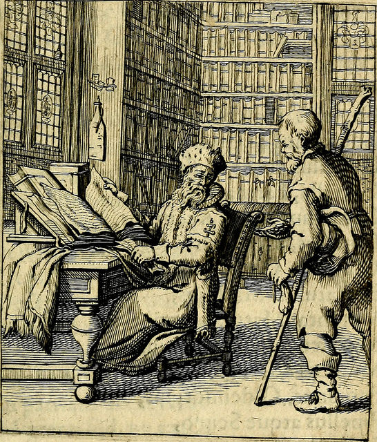
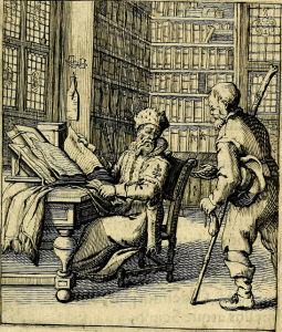
Readers write asking for signed bookplates, and I’ve long been meaning to make something special. I’m pleased with this one!
To make it, I scanned an old bookplate image, cleaned it up with Photoshop and printed it out on a 4×6 self-stick label.
For a signed bookmark, readers may email me through the contacts link on my blog:
http://sandragulland.com/contacts/index.html
by Sandra Gulland | Nov 18, 2009 | Adventures of a Writing Life |
Since arriving in San Miguel de Allende—in addition to catching up with friends and getting resettled—I prepared for a talk/reading.
I had planned to give the same reading I had given in Toronto in the spring, but realized that I really needed to revise it, make it current.
Of course this meant endless revisions and print-outs in addition to talking it out, timing it, and then, ultimately, practicing it in front of a mirror.
As a rule of thumb, I try to talk it through three times on the day of the event, the last one as close to the event as possible. Consequently, my voice was hoarse!
I like very much my new system of printing out the talk—every word, including the selections from the book—on 8.5 x 11 paper. I print it out in big, bold type that is easy to read, giving each sentence its own paragraph. I make sure to dog-ear the pages so that they are easy to turn. I use an elegant black binder to read from.
The talk went exceptionally well—so many people! The one thing I learned from it, however, is to make sure that the mike is working well for the audience. Some mikes you talk into—others you talk over. This was a talk-over kind, and sometimes—on a “t” sound, for example—I later learned that it spit the sound out at the audience. (I’ve seen one author who travels with her own mike, and I can understand why.)
The second reader of the evening—Barbara Levine, author of the amazing book Finding Frida Kahlo—had trouble with the low lighting. It was hard for her to see the text of her book. It occurred to me that a clip-on night-reader might be a handy thing to have on hand.
(Photo: the jardin at night in San Miguel de Allende. This is such a beautiful, vibrant and peaceful town, it pains me that visitors have been frightened away by the press north of the border.)
**********
Website: http://www.sandragulland.com/
Blog: http://sandragulland.blogspot.com/
Facebook: http://tinyurl.com/3xzbgv
Twitter: http://twitter.com/Sandra_Gulland
by Sandra Gulland | May 28, 2009 | Adventures of a Writing Life |
I was pleased with how my reading went last night (a worthy and well-run charity event to benefit world literacy). I think I’ve evolved a good system over the years, which is:
I type everything out—even the introduction, the jokey asides, and the passages from the book I’m reading from. I break most all of it into sentences (no long blocks of paragraphs). I print it out in large (16 pt.), bold type.
I read it out loud several times over, editing out any difficult words that make me stumble, and revising the book passages as well.
When it’s smooth, and clocks under the time allotted, I print it out and put it in a binder. I turn all the corners so that the pages turn easily. (This is important: having to lick a finger to turn a page would not be attractive on stage.) I underline or circle the words that still might catch me, words I’ll need to approach with care.
On the day of the reading, I try to read it through three times (although this isn’t always possible), and at least once in front of a mirror.
At the mike, after all this, I feel prepared. I don’t have to fiddle with reading glasses because the type is large. I don’t have to balance a book and fumble through the pages finding the passages. I don’t have to squint to read my penciled-in edits. The binder falls flat, so it lies nicely on a podium, but I could hold it in my hands if needed.
The only problem is that often the big, black mike is positioned above the page and it’s a little tricky to see the words. Juggling this makes me grateful for the time I spent in preparation.
One problem I foresee in the future is climbing and descending the sometimes rather steep (and often rickety) stairs, which of course never have railings. But that’s long into the future. I will count myself fortunate to still be giving readings by the time that might be a problem.
by Sandra Gulland | Mar 16, 2009 | Adventures of a Writing Life |

I don’t think there are many things more trying than renovating a website … a house, perhaps. In anticipation of the release of the paperback editions of Mistress of the Sun, I’ve been giving my somewhat complex website an up-date.
Or, rather, I’ve been telling others what I want done. This is strenuous when it’s a matter of “a little bit bigger,” “no smaller,” “no, a bit to the right.” If only I could do it myself! It’s both expensive (very!) and trying. Which is why I’m this minute downloading a trial of DreamWeaver software.
I’m fussy about the appearance of my site … and lucky, too, to have had Karen Templer (now of Readerville.com fame) and her then-business-partner Mignon design the original. Their web design company was called Quiet Space: which gives you an idea of their aesthetic. They were literary—rare in the tech world—as well as artists.
But the world moves on, not always quietly, and changes must be made. And so … will I wade into the horrors of HTML? When I should be researching and paying bills and answering emails and … ? I doubt it!
SaveSave