
Through The Readerville Journal, I’ve learned of several wonderful blogs on design. Two of these have become a regular inspiration: BibliOdssey and On Familiar Things. A new one is …By Henry Sene Yee Design. What I love about this blog is that Henry Sene Yee goes through the process of coming up with a good book cover design. For example, here are a few of the sketches he made …

… to come up with this wonderful cover:

One of the things I’m learning from this blog is the importance of communicating the spirit of a novel to the designer. One assumes that a designer will read the book. I suspect that Henry Sene Yee does, but I doubt very much that that is usually the case. (It’s a question of time, no doubt—not indifference.)
My Canadian and US publishers have each come up with “a look” for my books. Here is the new look of the Canadian paperbacks:
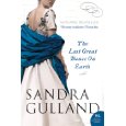


These are elegant, beautiful covers, and the striking design will be good for sales, no doubt, but I find it a bit uncomfortable. Personally, I’d like my books to look more like the type of books I read myself—abstract and literary (read: “small market”)—but I’m also uncomfortable mentioning this. I’m lucky to have “a market”, and supremely lucky to have publishers who wish to invest in new covers. However, it’s an emotional issue, an intensely personal one. Some authors go along, and others scream and shout. Many simply don’t have the energy or time—energy and time better spent writing. In any case, at a certain point, going along is the only option … and likely the wise one, too. Besides, these new covers are growing on me.
(P.S. The last, the rust gown, is my own.)
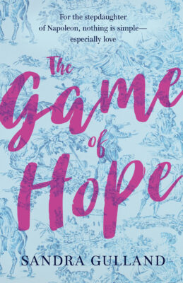
Exactly! You write literary historical fiction, these covers are pretty but in no way reflect the depth of the craft within your books.
On a positive note, maybe the covers will attract a new audience who might not pick up one of your books? And thus more people will become interested in GOOD fiction? We can hope!
–Amanda in Houston
Kailana, that’s my concern. The cover designs narrow the readership. Men won’t pick them up, but neither will some women.
I must say, I think the ‘headless’ models idea is getting a bit overdone. I wish they would think of something else, to be quite honest. It is also rather limiting in terms of readers because in many cases they look like romance novels, and many men wouldn’t even pick them up off the shelf… Which is a shame, really.