I started writing this post six months ago, back when The Game of Hope was titled Moonsick. As part of the final revision, then, I was looking for “legal” and “illegal” words—that is, words that didn’t exist in 1800.
Here are the words and phrases I was surprised to discover were sufficiently ancient:
eavesdropping
suicide
like wild
in the pink
I continued to do this for every draft that followed, keeping a master list of okay, and not okay words.
I sent in the “final final” draft yesterday around 2:00, and last night, at dinner, I made a note to check yet another word. (Can I find that post-it now? No!)
The next step
The next time I see This Book of a Thousand Drafts (in only two weeks) it will have been transformed into “pages”—that is, looking more and more a book. At this point, there will be a limit to the type of changes I will be able to make. The odd word here and there, perhaps. A paragraph cut or added? Certainly not. Anything that would throw the layout off would topple the entire structure like a house of cards.
I recall that it used to be that an author could make minor changes at this stage—to what we then called galleys—but beyond that, he or she paid, because it was costly for the publisher to make changes.
I’m incapable of not making changes, however, and I remember going over each line carefully, dotting each page with corrections. And then the corrections to the corrections would have to be checked, etc., etc., etc. Indeed, the moment I hold the published book in my hand, I will set an extra copy on the shelf marked “changes.” This copy will also get marked up.
I was, I hope, more cautious with this final draft of The Game of Hope, and will examine the coming pages carefully—because next will be ARCs (Advance Reading Copies), and it’s painful to see glaring errors at that stage. (I trashed an entire box of Tales of Passion, Tales of Woe ARCs because of all the errors.) It’s acceptable to have a few mistakes in an ARC, but I dislike it.
And beyond …
Someone once defined publishing as bringing a forcible halt to the writing process. The publishing process can be ongoing—there will be (one hopes) a paperback edition, foreign editions—it’s never-ending. Paul Kropp once told me that he never really understood one of his novels until he rewrote it for the UK edition. The Life of Pi was first published in Canada, but I read that it underwent massive editorial surgery for its UK edition—the version the world loved.
The transition to digital has made the process somewhat smoother, but there have been glitches. I used to make editorial notes to myself in my Word document, formatting them as invisible. In the early days of the transition to digital, some of these “invisible” asides showed up in the Pages for Tales of Passion, Tales of Woe. And so, in a poignant scene, up pops my editorial: Wouldn’t her doctor have considered a venereal disease? I still remember the shock I felt seeing those words in the text of my novel. The production department lost sleep over that glitch, too, making sure that there were no others.
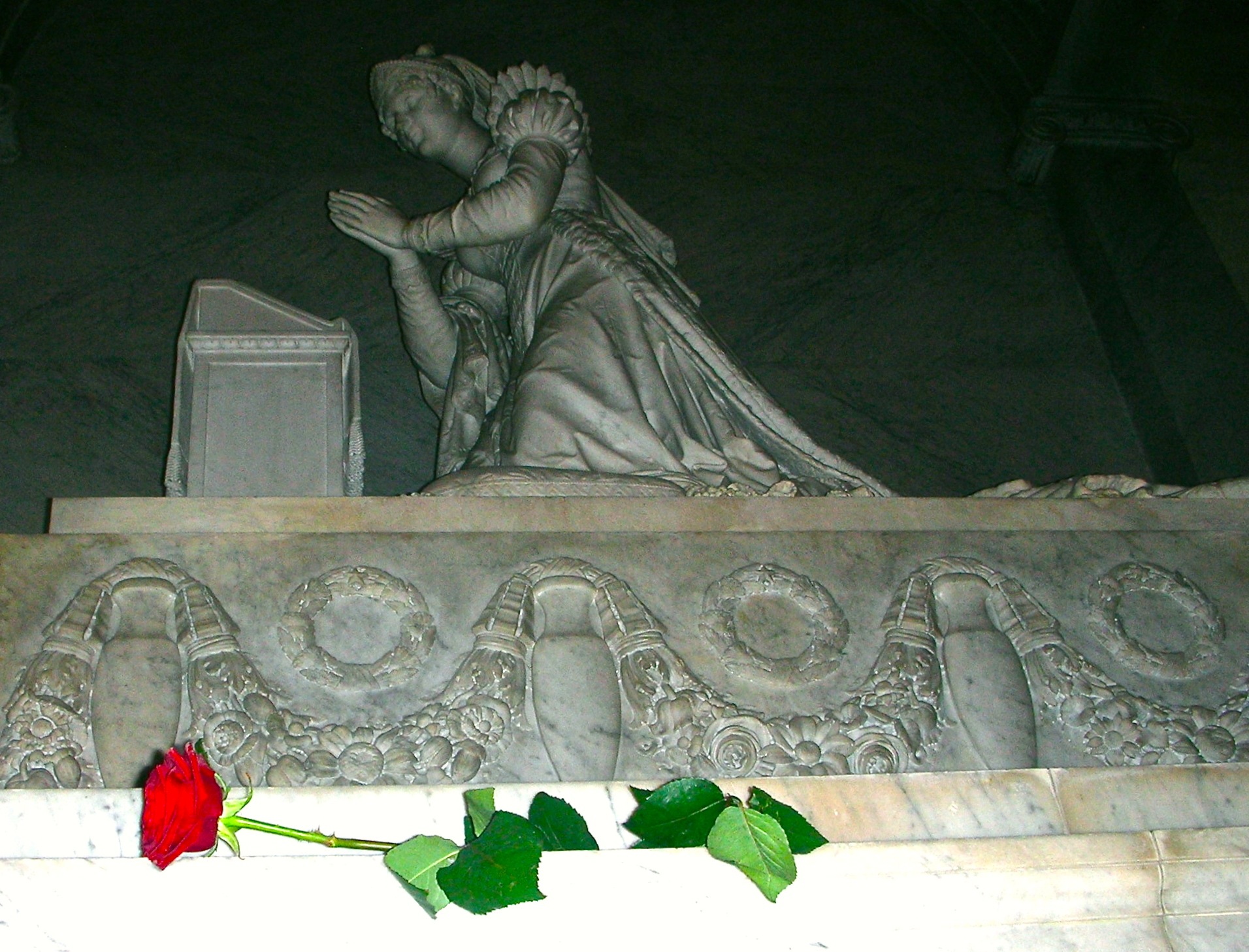
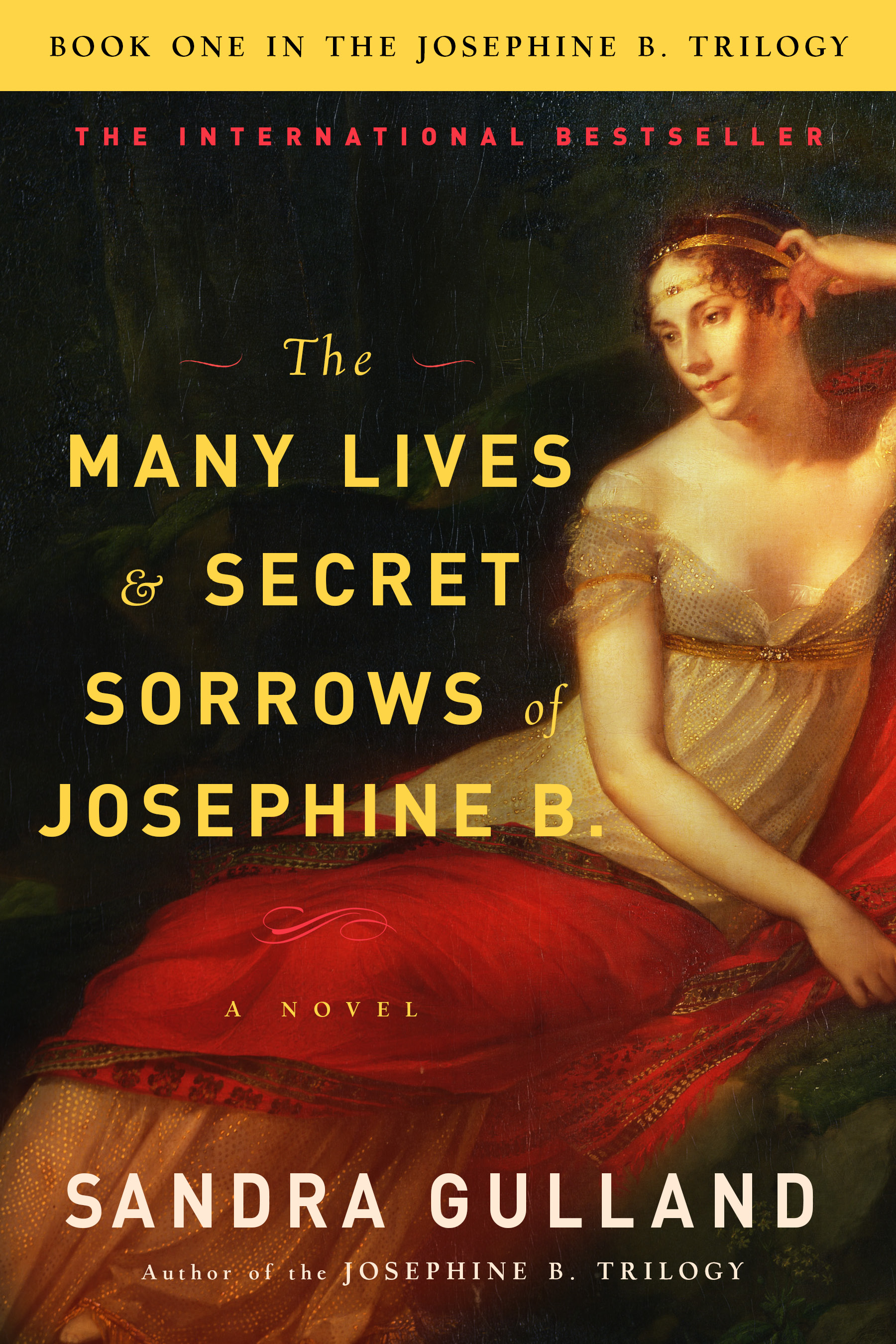
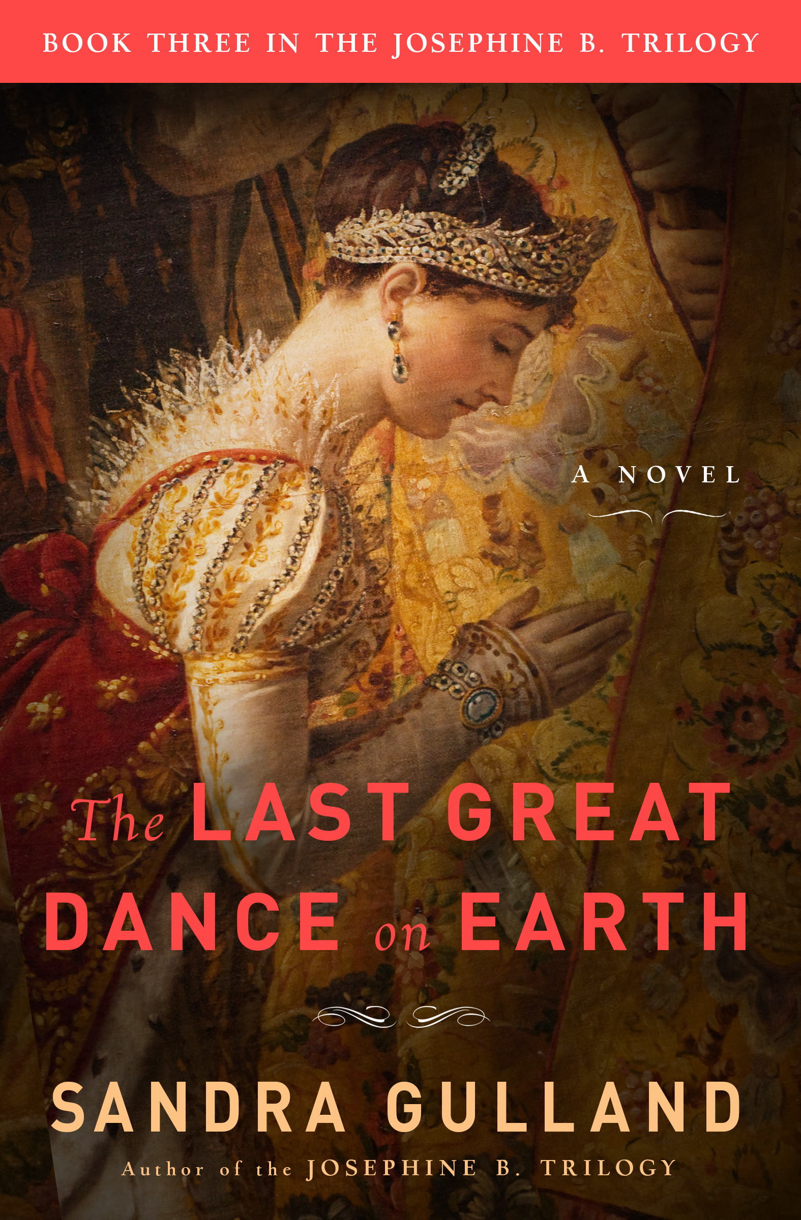
Today—Thursday, June 24th—is the bicentennial anniversary of Josephine’s death, 200 years ago. Special exhibits have been shown in Paris, and there will be a very special event at Malmaison, no doubt. In the past, Malmaison has marked this day with a concert of classical music in the Music room. I was told by the former curator that invariably, a sudden chill would sweep through the room—Josephine’s spirit, he was convinced, for it happened every time, in spite of the summer heat. This is one time that I ache to be there. All this week, I’ve been posting to a new Pinterest board I created for the occasion: “Celebrating Josephine.” In honour of the bicentennial, Touchstone (of Simon & Schuster)— the U.S. publisher of the Josephine B. Trilogy—has designed new covers for the ebook editions.
To give you the funny-but-hard-hitting sense of it, Step #1 is: If you’re actually lazy, GTFO.
Amen.
On the home front:
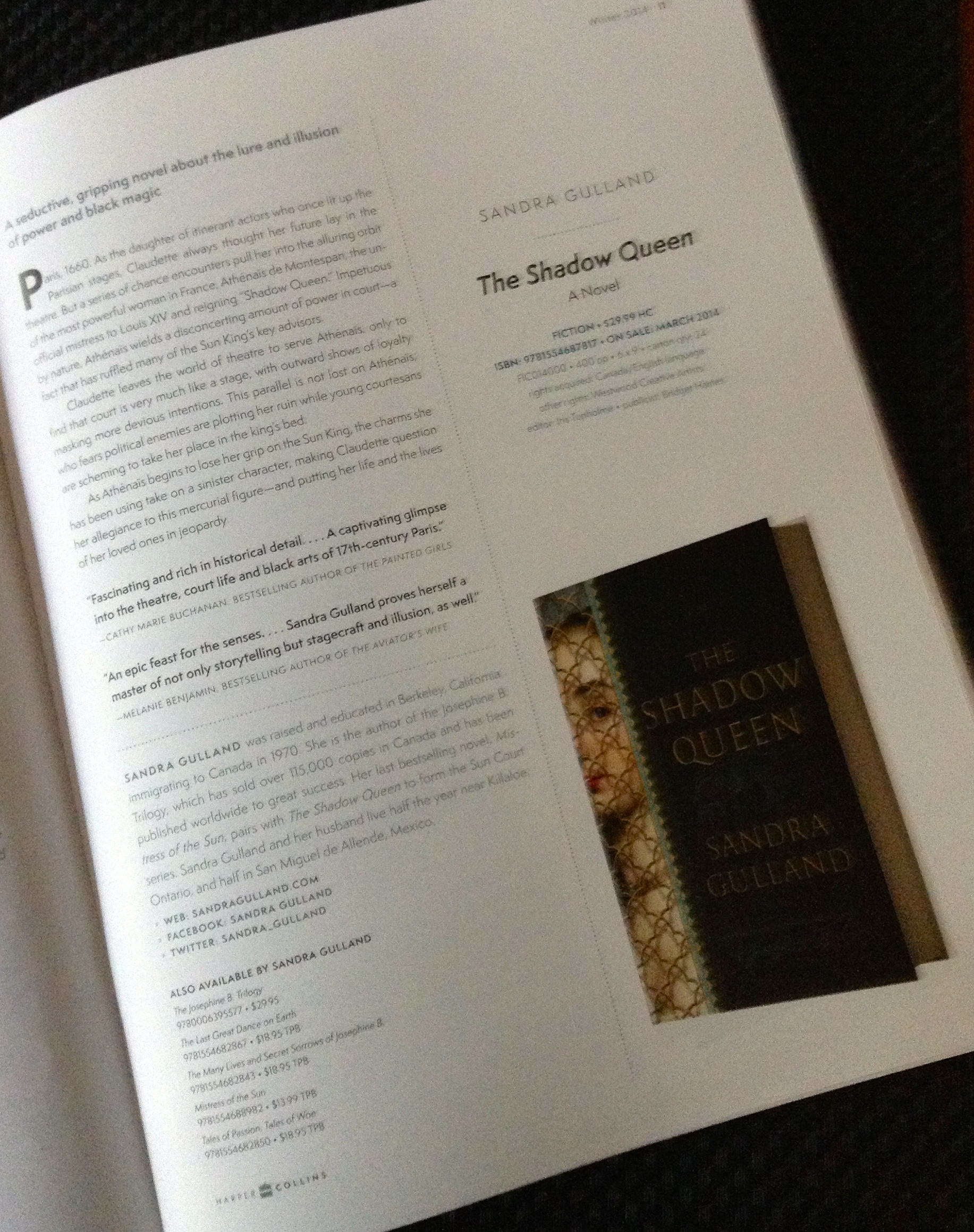
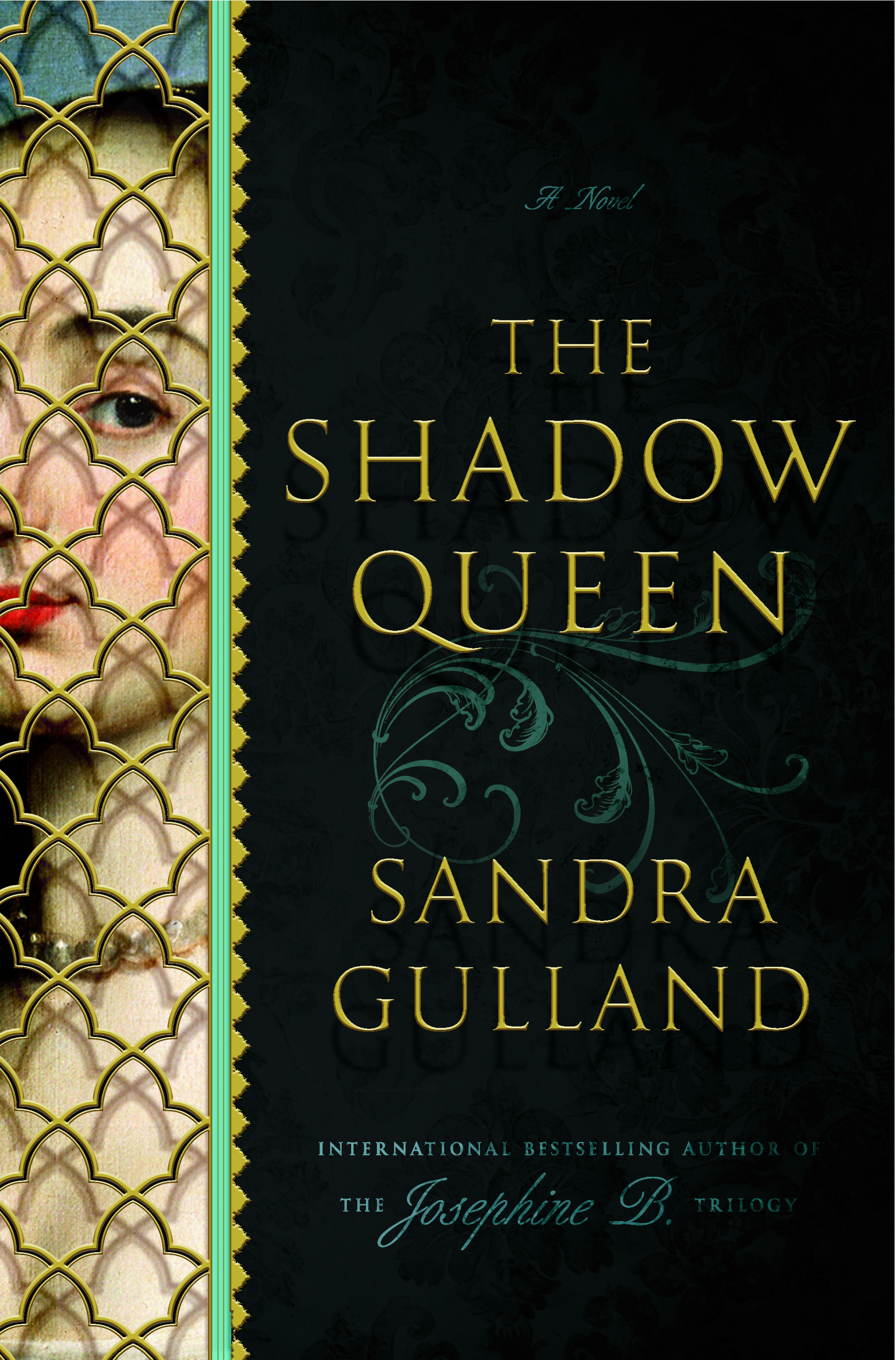
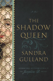
THE SHADOW QUEEN has a pub. date: April 8, 2014. I’ve sent off the corrected 1st Pass pages and I’ve only the Acknowledgements and the very last sentences of the novel to tweak. I’ve a storage box on my office floor where everything to do with The Shadow goes now, labelled “archival.” (I.e. my crowded basement.)
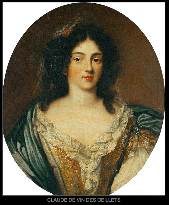
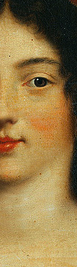
I was speechless! A portrait of my Claude? I didn’t think one existed. (I Googled for it when I began my research and came up with nothing.)
Look familiar?
I’ve emailed Doubleday to find out if they used the portrait as a basis for the cover.
I was pleased when I first saw the cover because the woman looked like how I’d imagined Claude to look. (Eyebrows!)
And now: well! To find out that it looks like the real Claude: I’m blown away.
Late breaking news (two days later): my editor at Doubleday, Melissa Danaczko, checked: the cover designer had never seen a portrait of Claude, much less this one.
Yesterday I was sent an email from Melissa Danaczko, my editor at Doubleday US, with the subject line “cover!” I paused for more than a moment, praying, I confess! “Please, let it be wonderful.”
I had every reason to trust that Melissa—and her team—would produce a wonderful cover, but I’ve experienced a few nasty shocks over the years: a cover showing my blonde heroine with jet-black hair, another of a young woman with her bodice ripped. (No, I do not write bodice-rippers!)
Finally, I opened it, and I am absolutely enchanted:
The plan is to emboss the type and screen with gold, which will make it really lush.
Space is left open at the top for a blurb—and I’ve already had some wonderful ones, which I will publish here next.
It means that her new collection of short-fiction is being published in hand-set monotype, printed on a 1890 Chandler-Price press.
Hugh Barclay of Thee Hellbox Press notes: “Letterpress, unlike offset, leaves a tactile impression in the paper that will sometimes sparkle in the slanting morning sun.” (I love that: it only all our written words would actually sparkle.)
But this edition really goes further than that. Delicious details:
• A numbered edition of 300 copies. (And my copy, reserved long ago, is #1!)
• Hard cover, case bound, allowing it to be opened flat.
• The cover boards are wrapped in Ajisia Gold, a colourfast Japanese paper. (The name translates into hycinthia.)
• Some uncut pages. (Don’t books with uncut pages simply thrill you?)
• Merilyn’s son, artist Erik Mohr, has created over fifteen outstanding lino cuts to go with the stories.
• The endpapers are individual works of art created by Emily Cook, reflecting Merilyn’s gardens. The paper contains flowers from her gardens. All of this reflects the theme of the collection: the stories in the main deal with gardens and the human situations around them.
• The book is printed on St. Armand’s mold made acid free paper known as “salad” paper.
• All materials used in the book—including adhesives used in binding—are acid free to ensure longevity.
Almost a half-century ago, I stumbled into a used bookstore in San Francisco seeking a book by the poet Kenneth Patchen. The owner guided me to a numbered edition with cover art by the poet. I flew out of that store with that book in my arms! It is now one of my treasures. (And worth quite a lot.)
If you or someone you know would love a book as art object—made painstakingly in the old-fashioned way—and, in addition, if you’d like a work by Merilyn, who is such a fine literary writer (see her books here), I recommend that you contact Hugh to reserve one of these numbered copies of The Paradise Project for yourself. The price: $150 Cdn. is very reasonable for such a collector’s edition. Hugh Barclay can be reached at .