{Photo by Leah Feldon, taken from the roof terrace of our house in Mexico at sunset.}
We’re nearing the end of our half-year stay in San Miguel de Allende in central Mexico. I begin to feel the push/pull of leaving one home and returning to another.
There is always the challenging business of clearing the desk — the piles of papers! — and deciding which books go, and which ones remain behind.
The books that go back and forth are research texts. For pleasure while here, I read almost exclusively on my iPad. There is no longer a good bookstore here (alas!), and ordering on-line is expensive. When I return to Canada, one of my first stops will be at a bookstore.
I love digital reading, but I love books even more, love the sensual dimension of holding a book in my hands, turning the pages, gazing at the cover, making notes in the margins. I love, too, picking out the perfect bookmark (I have quite a collection).
This wonderful YouTube TED talk by Chip Kidd on book design brought all that home to me:
Ah, the smell of a book! As an editor, I loved when the printed book arrived: I would always take a deep sniff. (Books and horses are similar that way.)
What do you love about a book? What books have been extra special physically for you?
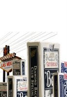
Through The Readerville Journal, I’ve learned of several wonderful blogs on design. Two of these have become a regular inspiration: BibliOdssey and On Familiar Things. A new one is …By Henry Sene Yee Design. What I love about this blog is that Henry Sene Yee goes through the process of coming up with a good book cover design. For example, here are a few of the sketches he made …
… to come up with this wonderful cover:
One of the things I’m learning from this blog is the importance of communicating the spirit of a novel to the designer. One assumes that a designer will read the book. I suspect that Henry Sene Yee does, but I doubt very much that that is usually the case. (It’s a question of time, no doubt—not indifference.)
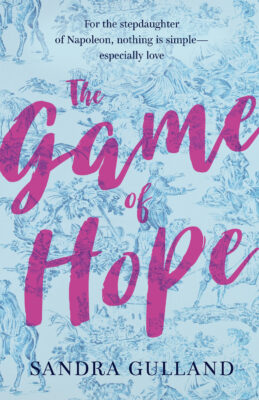
My Canadian and US publishers have each come up with “a look” for my books. Here is the new look of the Canadian paperbacks:
These are elegant, beautiful covers, and the striking design will be good for sales, no doubt, but I find it a bit uncomfortable. Personally, I’d like my books to look more like the type of books I read myself—abstract and literary (read: “small market”)—but I’m also uncomfortable mentioning this. I’m lucky to have “a market”, and supremely lucky to have publishers who wish to invest in new covers. However, it’s an emotional issue, an intensely personal one. Some authors go along, and others scream and shout. Many simply don’t have the energy or time—energy and time better spent writing. In any case, at a certain point, going along is the only option … and likely the wise one, too. Besides, these new covers are growing on me.
I was pleased to learn this morning (through a Yahoo group!) the title of the German edition of Mistress of the Sun: Die Sonne des Königs, which I’m told translates as Sun of the King, a title I like. When I googled that title I got 46 hits—all showing the novel available for pre-order. At last I found what I was seeking: an image of the cover, which I rather like. (Although with one concern: the image of the King, from what I can tell—it doesn’t enlarge well—might be from a portrait of him as an old man. I hope not.)
In the process, I discovered a simply hideous cover of Joséphine. (I wonder which of the Trilogy that title would be.) In general, the translated editions have been gorgeous, but this one? Not!
And so: to work. Today I’ve a “guest blog” post to pull together, as well as on-going work on the plot of The Next Novel. It’s the usual push-pull between fact and fiction. I develop a storyline, and then discover a fact that unravels it completely, sending me back to the drawing board. It’s always a puzzle to work out a story within a framework of fact—but it’s a puzzle I enjoy.